Final Project – Crusade for Children
*I am in no way affiliated with this organization. These materials were developed strictly for educational purposes.*
Company Analysis
The WHAS Crusade for Children is a nonprofit public charity formed in 1954 by Louisville, Kentucky based television and radio station WHAS. An internet/radio/telethon is held each year during the first full weekend in June, and fire departments take donations in busy intersections all around Louisville.
The target audience is anyone in the Louisville area – donations can be given around the city, online, over the phone, and through the telethon. For this reason, localized marketing is the most important strategy.
Logo Design
I wanted to redesign the logo to clarify some things about Crusade for Children as an organization – first of all, having all of the text in capital letters is a bit confusing, as it makes WHAS look like it is an actual word rather than a media outlet. Secondly, CFC is a Kentuckiana-based organization (Kentucky and parts of southern Indiana), so I added the shape of Kentucky. It is already obvious that they focus on the needs of children from the name, so it made sense to take out that depiction. I used the same blue from the original logo, adding a complimentary lighter shade and a green – after all, we are the Bluegrass State.
logo redesign
Print Promotions
These print materials would be sent out to corporate sponsors to be used at their own discretion, as well as existing benefactors from previous years. A general mass mailing of the postcards could be sent out to residents of the city of Louisville as a reminder of the telethon as well.
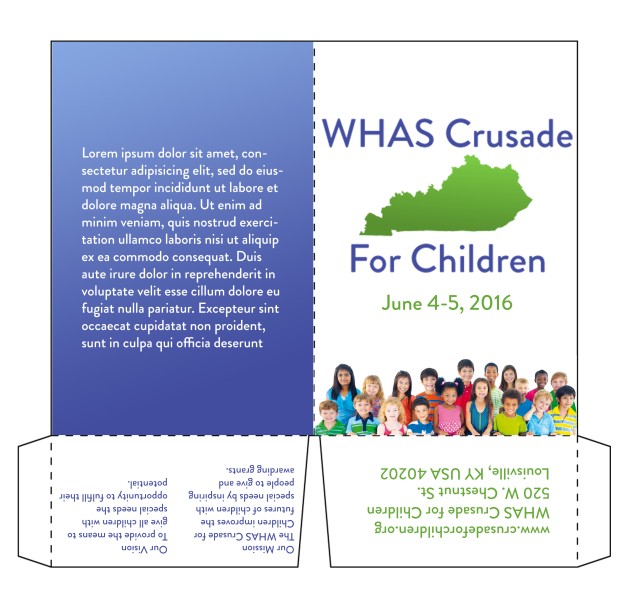
folder
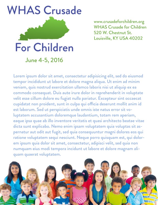
flyer
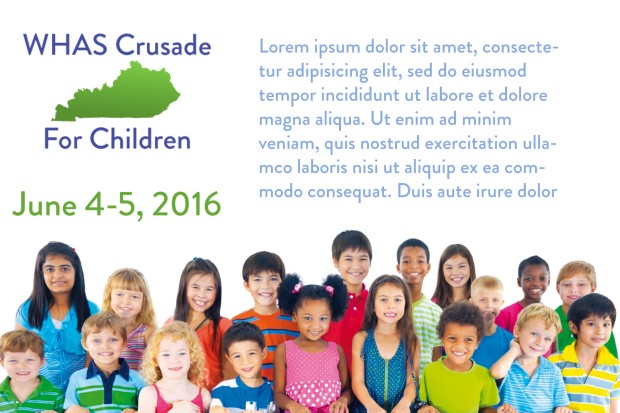
postcard
Social Media
Since the CFC’s audience is so broad – anyone willing to donate money to a good cause – the social media campaign must be all-encompassing and quite active. I would recommend posting at least twice per day, and up to four during the active fundraising season. It is important to highlight some of the specific grants and individuals that have been helped through their efforts, in order to make the organization more personal.
I would also recommend utilizing Twitter to help reach the younger audience and offer real time updates during the telethon as donations come in. This will also facilitate direct conversations with individuals and can link to organizations that have benefited from donated money.
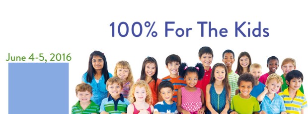
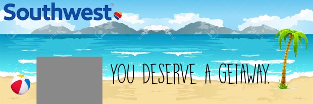
Facebook cover photo
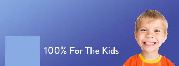
Facebook cover photo

Facebook cover photo
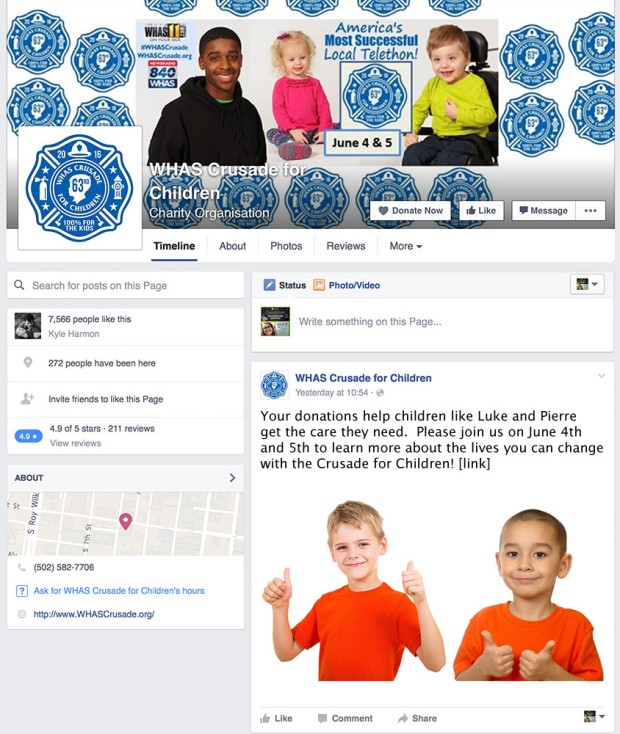
Facebook post
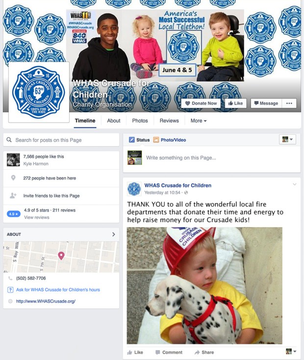
Facebook post
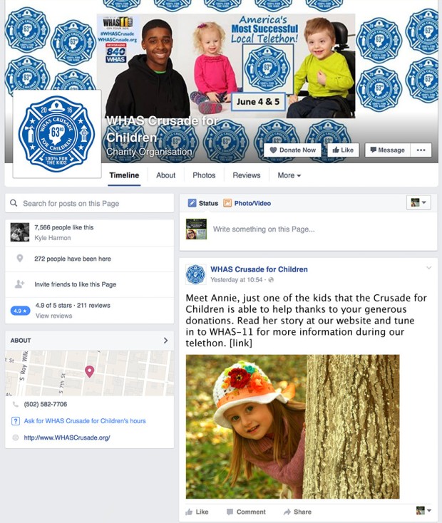
Facebook post
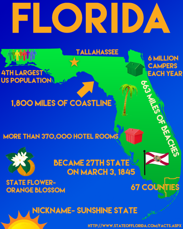
Infographic
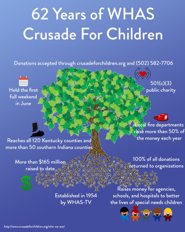
infographic